Make a LaForge theme
A LaForge theme is a folder with a manifest, skin.json, and the files it names: stylesheets, fonts and images. This tutorial builds one from an empty folder to a theme that installs, draws light and dark, and is ready to share. It takes under fifteen minutes, and you need LaForge 0.1 or later (install it) and a text editor. The full reference is docs/skins.md.
The example is called Lagoon: deep teal water and a coral accent. Here it is in both modes, built from exactly the two files below.
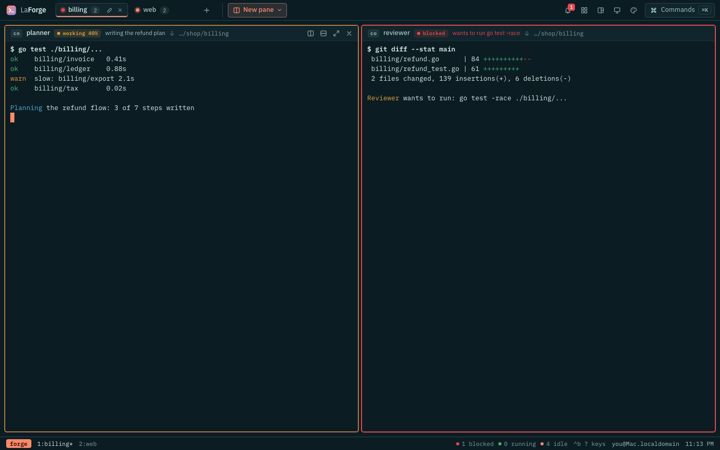
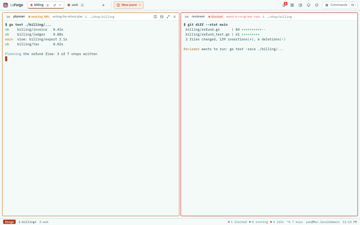
The steps: 1. Scaffold · 2. The manifest · 3. Custom properties · 4. Light and dark · 5. Hooks · 6. The rail layout · 7. Fonts · 8. Check, install, iterate · 9. Share it · 10. Troubleshooting
Let an agent do it. LaForge has an agent skill for building themes, laforge-theme. An agent such as Claude Code can use it to build a theme for you from a description, in both modes, and check it with
la skin checkbefore you install it.
1. Scaffold the folder#
la skin new lagoonmade lagoon in lagoon (skin.json, skin.css, README.md)
next: edit skin.css, then la skin check lagoon && la skin install lagoonla skin new NAME [DIR] makes the theme's folder (DIR, or ./NAME when you leave it out) with three files: a skin.json with a terminal palette for each mode, a skin.css with the main colour tokens for light and dark, commented, and a README.md. It installs as made, so you start from a working theme and change it. la skin new and la skin check are new, after LaForge 0.1.0: if your la does not have them yet, make the files by hand. Two are all a theme needs:
lagoon/
  skin.json
  skin.css
The folder's name and the name in skin.json must match. Here are both files, complete. Copy them as they are, install them (step 8), then change them.
lagoon/skin.json:
{
  "name": "lagoon",
  "label": "Lagoon",
  "description": "Deep teal water and a coral accent, in light and dark.",
  "version": "1",
  "author": "You",
  "license": "Apache-2.0",
  "layout": "classic",
  "css": ["skin.css"],
  "terminal": {
    "dark": {
      "background": "#0b1d22",
      "foreground": "#d8ece9",
      "cursor": "#ff8a65",
      "selectionBackground": "rgba(255, 138, 101, 0.3)"
    },
    "light": {
      "background": "#f3faf8",
      "foreground": "#16323a",
      "cursor": "#b23c1f",
      "selectionBackground": "rgba(178, 60, 31, 0.2)"
    }
  }
}lagoon/skin.css:
/* Lagoon: deep teal water and a coral accent, in light and dark. */

/* Shapes: the same in both modes. */
:root[data-skin='lagoon'] {
  --radius-pane: 4px;
  --radius-control: 4px;
  --radius-button: 4px;
}

/* Dark: colours only. */
:root[data-skin='lagoon'][data-mode='dark'] {
  --canvas: #08161a;
  --side: #0b1d22;
  --sunken: #061114;
  --card: #10262c;
  --term: #0b1d22;
  --hover: rgba(216, 236, 233, 0.08);
  --press: rgba(216, 236, 233, 0.14);
  --line: #24464f;
  --line-2: #173238;
  --tx: #d8ece9;
  --tx-2: #a3c4c0;
  --tx-3: #7fa29e;
  --acc: #ff8a65;
  --acc-500: #ffab91;
  --acc-100: rgba(255, 138, 101, 0.16);
  --acc-fill: #ff8a65;
  --on-acc: #2a0e05;
}

/* Light: the same tokens, for a light ground. */
:root[data-skin='lagoon'][data-mode='light'] {
  --canvas: #e4f1ee;
  --side: #f3faf8;
  --sunken: #d9ebe6;
  --card: #ffffff;
  --term: #f3faf8;
  --hover: rgba(22, 50, 58, 0.06);
  --press: rgba(22, 50, 58, 0.11);
  --line: #b5d3cc;
  --line-2: #d3e6e1;
  --tx: #16323a;
  --tx-2: #3b5d64;
  --tx-3: #4b6a70;
  --acc: #b23c1f;
  --acc-500: #d4603f;
  --acc-100: rgba(178, 60, 31, 0.1);
  --acc-fill: #b23c1f;
  --on-acc: #ffffff;
}

/* Hooks: an underline on the active tab, and pane frames by status. */
[data-skin='lagoon'] .tab.is-active {
  box-shadow: inset 0 -2px 0 var(--acc);
}
[data-skin='lagoon'] .pane[data-status='working'] {
  border-color: var(--amber);
}
[data-skin='lagoon'] .pane[data-status='blocked'] {
  border-color: var(--red);
  box-shadow: 0 0 0 1px var(--red);
}
2. The manifest#
skin.json says what the theme is and which files to load. Every field but name is optional, and an unknown field is refused, so a typo is caught when you install.
| Field | What it is |
|---|---|
name | The theme's id: lower-case letters, digits and dashes, at most 40. It must match the folder's name. |
label | What people see in the Themes panel and the palette. Defaults to name. |
description | One line about it, shown in la skin list and the panel. |
version, author | Yours to set; shown in the panel and la skin list. |
license | The licence your files are under, such as Apache-2.0 or MIT. |
layout | classic (tabs above the panes) or rail (spaces and crew in a rail at the left). Defaults to classic. |
css | The stylesheets, in order, relative to the folder. A theme may leave it out and change only the terminal. |
terminal | The terminal's colours, one palette per mode: {"dark": {…}, "light": {…}}. |
terminal has a palette for each mode. Its keys are background, foreground, cursor, cursorAccent, selectionBackground, selectionForeground, the eight colours black, red, green, yellow, blue, magenta, cyan, white, and their bright forms brightBlack to brightWhite. Values are #hex, rgb() or rgba(). A key you leave out keeps the mode's own colour, and a mode you leave out keeps the client's own palette, so Lagoon sets only the four that matter most.
There is no mode field: every theme draws both, and the viewer chooses.
3. Custom properties#
Most of a theme is setting custom properties. Colours go under each mode, :root[data-skin='lagoon'][data-mode='dark'] and …[data-mode='light']; shapes, sizes and faces go under the theme alone, :root[data-skin='lagoon'].
Change these first. They carry most of the look:
| Property | Used for |
|---|---|
--canvas, --side | the page behind everything; the top bar, footer and rail |
--card, --term | panels, pane headers and menus; the pane body behind the terminal |
--line | borders |
--tx, --tx-2, --tx-3 | text: primary, secondary, muted |
--acc, --acc-fill, --on-acc | the accent: as text, as a solid fill, and text on that fill |
--radius-pane, --radius-control | the corners of pane frames; of tabs, icon buttons and rows |
Then the rest. Status colours follow the states: --amber for working, --red for blocked and errors, and done in the accent, --acc. Colours:
| Property | Used for |
|---|---|
--canvas | the page behind everything |
--side | the top bar, footer, rail and chrome |
--sunken | recessed areas |
--card | panels, pane headers, menus, inputs |
--term | the pane body behind the terminal |
--hover, --press | hover and pressed fills |
--line, --line-2 | borders, strong and faint |
--tx, --tx-2, --tx-3 | text: primary, secondary, muted |
--acc, --acc-500, --acc-100, --acc-fill, --on-acc | the accent: text, light, tint, solid fill, text on the fill |
--ai, --ai-600, --ai-100, --ai-50 | agent chips and labels |
--red, --red-50 | blocked, error, failed |
--amber, --amber-50 | working, warnings |
--green | running |
--todo | idle, ended |
--on-red | text on a red count bubble |
--scrim | behind dialogs |
--e2, --e3 | shadows of raised and floating things |
--shadow-tab | the active tab's shadow |
Faces:
| Property | Used for |
|---|---|
--font-ui | all interface text |
--font-mono | paths, keys, counts, messages |
--font-display | big titles (the rail's machine and space names); defaults to --font-ui |
The terminal keeps its own monospace face.
Shapes and sizes (with Classic's values):
| Property | Classic | Used for |
|---|---|---|
--radius-pane | 10px | pane frames, the agents panel |
--radius-dialog | 12px | the palette and help |
--radius-card | 9px | profile cards, the ended bar |
--radius-mono | 8px | profile monograms |
--radius-control | 7px | tabs, icon buttons, rows |
--radius-button | 6px | text buttons |
--radius-button-sm | 5px | small buttons |
--radius-chip | 4px | badges, chips |
--radius-pill | 999px | counts |
--topbar-height | 40px | the tab bar |
--statusbar-height | 26px | the footer |
--pane-head-height | 30px | a pane's header |
--work-gap | 6px | space around the panes |
--pane-gap | 3px | space between panes |
--rail-width | 248px | the rail (rail layout) |
4. Light and dark#
The client sets the mode on the root element, along with the theme and the layout:
<html data-skin="lagoon" data-layout="classic" data-mode="dark">The viewer picks the mode with the light/dark button, which steps through following the system, light and dark, under every theme. Your theme styles both, so write every colour twice, once under each [data-mode], and scope every rule to your theme so nothing leaks while a switch is under way:
:root[data-skin='lagoon'] { --radius-pane: 4px; }                     /* both modes */
:root[data-skin='lagoon'][data-mode='dark'] { --acc: #ff8a65; }       /* dark */
:root[data-skin='lagoon'][data-mode='light'] { --acc: #b23c1f; }      /* light */
[data-skin='lagoon'] .pane-title { letter-spacing: 0.02em; }           /* a hook */
An accent that is bright enough on a dark ground is usually too faint on a light one, so pick each mode's colours on their own. Keep text at a contrast ratio of at least 4.5:1 against the ground it sits on (WCAG AA): --tx, --tx-2 and --tx-3 against --canvas, --side and --card, --on-acc against --acc-fill, and the terminal's foreground against its background. Lagoon's muted text, --tx-3, is the closest: 5.0:1 on the light canvas and 5.7:1 on the dark cards. Any contrast checker will tell you the ratio of two hex colours.
5. Hooks for deeper styling#
Past the custom properties, every region has a class, and the parts that change with state carry data attributes. These hooks are stable: a theme may rely on them, and on nothing else, since other class names may change.
Tabs and pane frames by status. .tab[data-status] is a tab's most urgent pane: blocked, error, done, working, idle, or, with no reports, running, failed, complete, empty. .pane[data-status] is a pane's own status, and data-active="true" marks the focused pane of the active tab.
[data-skin='lagoon'] .tab[data-status='blocked'] { box-shadow: inset 3px 0 0 var(--red); }
[data-skin='lagoon'] .tab[data-status='working'] .tab-name { color: var(--amber); }
[data-skin='lagoon'] .pane[data-status='done'] { border-color: var(--green); }
[data-skin='lagoon'] .pane[data-active='true'] .pane-head { background: var(--acc-100); }
A pane's header is .pane-head, with .pane-title, .pane-msg, .pane-cwd and the status badge .badge.badge-<status>; Allow and Deny are .ask-allow and .ask-deny.
The agents panel. .agents is the panel, .agent-row[data-status] a row, .agent-row.is-current the focused one:
[data-skin='lagoon'] .agent-row[data-status='blocked'] { background: var(--red-50); }The rail. In the rail layout, .rail is the rail, .rail-space.is-active the chosen space, .crew-row[data-status] an agent in the crew and .crew-row .crew-bar its status bar, and .rf-count[data-kind] the footer's counts. The tab bar, palette, banners and the rest are listed under Hooks in docs/skins.md.
6. The rail layout#
Set "layout": "rail" and the forge puts a rail at the left: the machine, the Spaces (a pane's space is its space label, else the last part of its folder) and the Crew (every pane that reports a status or runs an agent, most urgent first, with Allow and Deny inline). At the right go a header with the date, time and space, the tabs, the panes and a footer of counts. Below 640px the rail becomes a drawer.
Choose rail when you run several agents across more than one project and want who needs you always in view; choose classic when you want every pixel for panes. The client draws the rail plainly, and your theme gives it its look:
[data-skin='lagoon'] .rail { background: var(--side); border-right: 1px solid var(--line); }
[data-skin='lagoon'] .rail-space.is-active { box-shadow: inset 3px 0 0 var(--acc); }
[data-skin='lagoon'] .crew-row[data-status='blocked'] .crew-bar { background: var(--red); }
/* "SPACES 05": counts carry data-padded, the number with two digits */
[data-skin='lagoon'] .rail-title .rail-count { font-size: 0; }
[data-skin='lagoon'] .rail-title .rail-count::before { content: attr(data-padded); font-size: 12px; }
The built-in Console theme is a full rail example in both modes: forge/skins/console/skin.css.
7. Fonts#
A theme may bundle its own fonts. The forge works offline and a theme loads nothing from the network, so there is no CDN: put the font files in the folder, as woff2, with their licence. Use a font whose licence lets you bundle it, such as the SIL Open Font License (OFL) most open fonts use, and include its text:
lagoon/
  skin.json
  skin.css
  fonts/
    space-grotesk-500.woff2
    OFL.txt
@font-face {
font-family: 'Lagoon Display';
src: url('fonts/space-grotesk-500.woff2') format('woff2');
font-weight: 500;
font-display: swap;
}
:root[data-skin='lagoon'] { --font-display: 'Lagoon Display', var(--font-ui); }Relative url()s resolve inside the theme's folder. The Fontsource packages carry woff2 files of most open fonts; Console bundles IBM Plex Mono this way, with fonts/OFL.txt.
8. Check, install, iterate#
Check the folder without installing it:
la skin check ./lagoonlagoon (Lagoon, classic layout) installsla skin check DIR runs the same checks as an install without touching the forge, then looks further and prints a warning: line for each thing worth fixing:
- a mode the stylesheet never styles, or a mode with no terminal palette;
- text under 4.5:1: the terminal's foreground on its background,
--txon--canvas,--cardor--side, and--on-accon--acc-fill; - a
--termthat differs from the terminal's background, which shows as a seam around the terminal; - a folder named differently from the theme;
- no
licenseor nodescription.
lagoon (Lagoon, classic layout) installs
  warning: no terminal.light palette: the terminal keeps the client's light colours
  warning: no description in skin.json: the theme panel and collections show it
Warnings do not stop an install. la skin check --strict DIR exits with 1 on any warning, for a script or a pull request check. If your la has no la skin check yet, la skin install runs the install checks and stops at the first problem.
Then install it and make it yours:
la skin install ./lagoon
la skin use lagoon
installed lagoon (Lagoon, classic layout)
choose it in the palette, or: la skin use lagoonla skin use makes it the forge's default; to try it in one browser only, pick it in the Themes panel or Skin: Lagoon in ⌘K. Flip the light/dark button to see both modes.
To iterate, edit the files, run la skin install ./lagoon again and reload the page. Installing a theme with the name of one already installed replaces it, and the forge serves theme files with no-cache, so the reload picks up the change. A theme whose stylesheet fails to load falls back to Classic.
To try themes without touching your own forge, run a scratch one. Export LAFORGE_HOME first, so every la command after it, not just the first, uses the scratch forge:
export LAFORGE_HOME=$(mktemp -d)
la up --port 4747
la skin install ./lagoon && la skin use lagoon
la down
9. Share it#
A theme is a folder, so a GitHub repository is the way to share it. A repository may hold one theme, with skin.json at its root, or many, one per folder, at the root or under skins/:
my-skins/
  README.md
  collection.json
  skins/
    lagoon/skin.json …
    ember/skin.json …
People install from it by name or by link, and la skin update brings them your new versions:
la skin install you/my-skins                 # every theme in it
la skin install you/my-skins//skins/lagoon   # one
la skin collections add https://github.com/you/my-skins
Added as a collection, it shows in the Themes panel's Get more. A collection.json at the root names it and its themes; without one, the themes are found as above and the collection is named after the repository:
{ "id": "my-skins", "name": "My skins", "description": "Sea and fire.",
  "skins": [{ "name": "lagoon", "label": "Lagoon", "description": "Deep teal and coral.", "path": "skins/lagoon" }] }
Public repositories work for everyone; a private one works for people signed in to GitHub who can read it (gh auth login, or $GH_TOKEN).
Or add it to the library. The library collection, RunOutcome/laforge-skins, gathers themes from the community and takes pull requests. A theme there must be:
- original work: your own design, with no one else's trademarks, logos or characters;
- both modes: light and dark, each with readable contrast;
- licensed: a
licenseinskin.jsonfor your files, and the licence text of any font you bundle; - data only: stylesheets, fonts and images, scoped to
[data-skin='<name>'], passingla skin check --strict.
The same rules are in the library's CONTRIBUTING.md.
10. Troubleshooting#
la skin install (and la skin check) stop at the first problem and say what it is, after the folder: la: .: skin.json: skins draw both light and dark; remove mode. The common ones:
| Message | What to do |
|---|---|
skin.json: skins draw both light and dark; remove mode | Delete the mode field and style both [data-mode]s. |
theme.js: a skin carries stylesheets, fonts and images only | Remove the file. A theme may hold only .css, .json, .woff2, .woff, .ttf, .otf, .png, .jpg, .jpeg, .webp, .gif, .svg, .md and .txt files. |
…: a skin may not hold links | Replace the symbolic link with the file itself. |
skin.json: name "Lagoon": lower-case letters, digits and dashes, at most 40 | Use a name like lagoon, and the same for the folder. |
skin.json: json: unknown field "autor" | A misspelt or unsupported field: check it against the table in step 2. |
skin.json: layout "sidebar": classic or rail | layout takes only those two. |
skin.json: terminal.dark.cursor "coral": a known key and a #hex or rgb() colour | Use a key from step 2 and a colour like #ff8a65. |
skin.json: terminal is {"dark": {…}, "light": {…}} | Put the terminal colours in a palette per mode. |
skin.json: css "style.css" is not in the skin | The stylesheet css names is missing or misspelt. |
console is a built-in skin; give yours another name | classic and console are taken. |
the skin is 18 MB; at most 16 | Shrink the images or fonts: a theme is at most 16 MB. |
./lagoon holds no skin: no skin.json at its root, in a subfolder or under skins/ | Point at the folder that holds skin.json, or the repository that holds the themes. |
GitHub answered 404 Not Found for you/my-skins at HEAD: … | Check the owner, repository and ref; for a private repository, sign in with gh auth login. |
If the theme installs but looks wrong, make sure every rule starts with [data-skin='lagoon'] (or :root[data-skin='lagoon']), that colours are under each [data-mode], and that you use the hooks from step 5 rather than other class names.
See what others made. Browse the official themes and the collections, or add yours to the library.
All themes